Tuesday, March 8, 2011

Blog #5

1. What is the most significant accomplishment in looking at your Midterm or  Final? You can talk about technique in Photoshop, investigating your Big  Idea, creating a meaningful artwork, etc.
Honestly, I like my midterm more than my final. I think I was really happy with the way the two panels  worked together as a diptych. It was a challenge to make the piece work as a whole and flow nicely into one another using Photoshop tools. I tried to accomplish that with a similar washed out background and similar lighting in both pieces. I also tried to make the artistic style similar in both panels. I think I was more successful in portraying my big idea of uncertainty in an artistically creative and thought provoking manner with my midterm as well. It was definitely a great challenge for me to take something I felt connected to personally, turn it into a established "big idea," and then find a way to present that big idea through Photoshop. So, my midterm in general was probably my most significant accomplishment.


2. Choose a project in the class and discuss your most challenging learning  experience in Photoshop. Focus on a technique or concept from Photoshop that was difficult at first, but that you mastered by the end of the quarter.


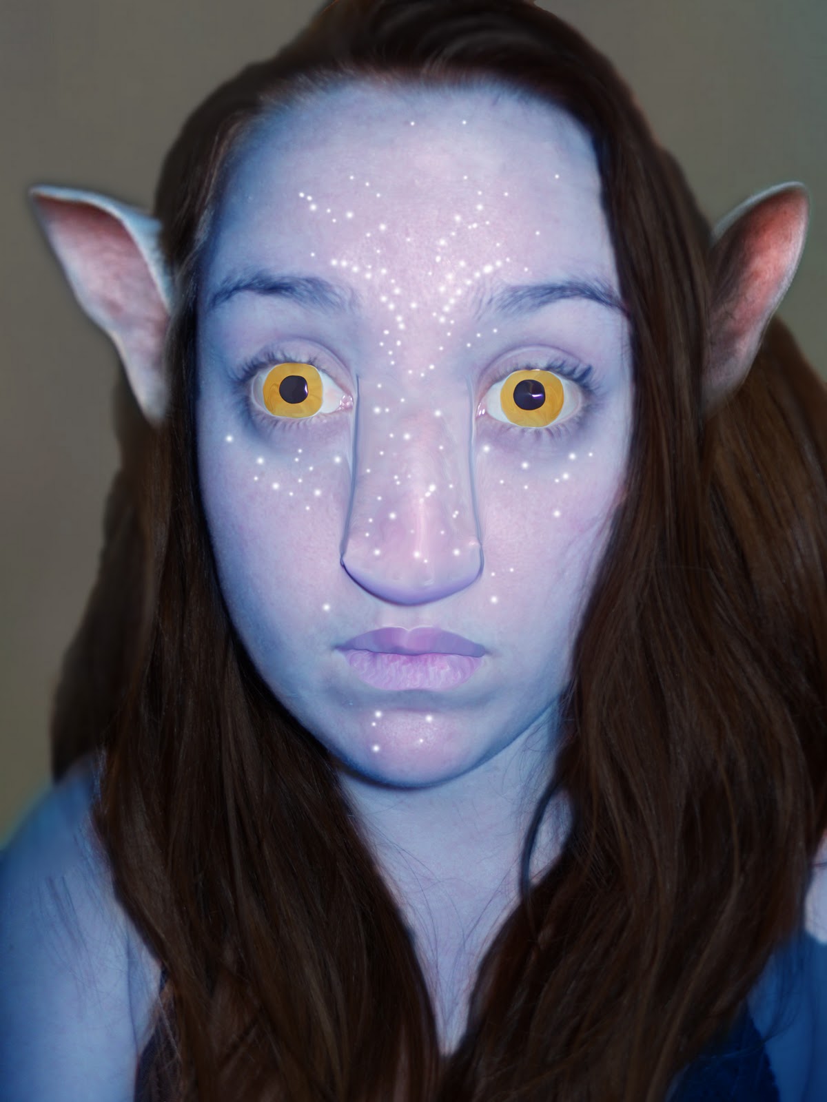
I think I would have to choose Quiz 3 and the final as projects I struggled with and was challenged by. Just applying physical transformations in a convincing and flawless way was hard for me to do successfully. When it was time to do quiz 3 I had a difficult time even coming up with a creative idea for retouching an image. Looking back on what I turned in for quiz 3 I see a lot of room for improvement. But, I think I did improve pretty significantly between that quiz and what I turned in for my final. I used a tutorial from worth1000 to help me convincingly retouch an image of my 19 year old friend Julie, making her look well into 70s or 80s. My use of the clone stamp tool and liquify tool improved through practice. I also learned how to effectively use masks, adjustment layers, filters, and layer styles in a way that made a piece of work look more reaistic and complete. These are all tools that baffled me at the beginning of the quarter. An aspect of quiz 3 that doesn't look so good would be the rough selection egdes of the hair, I think you can see where I was able to create a smoother transition on the final. I also think that my use of the liquify tool to make the lips bigger in quiz 3 could have been done better with a clone stamp tool, which is what I used to thin the lips in my final.

3. Compare two projects from the quarter to compare and contrast how you  achieved making meaning in the work. Try to showcase in your examples an improved capacity to making visual images that mean something as opposed to being a showcase of technique.


I chose to compare my Quiz 2, the selection quiz, to my midterm. Obviously, my main goal for quiz two was to just meet certain requirements within the class period. For quiz two I simply played around with the brightness and contrasts of images. I took an image of a flower, selected it out and placed it in a different picture. I also selected a butterfly from one picture into another. To make the changes more realistic I changed colors, added drop shadows, changed perspective and sizes and so on. I also made random use of the liquify tool. However, there is clearly no deep meaning or "big idea" begind this final image of a butterfly sitting on a flower. I was just showing that I could use certain techniques in photoshop. However, in my midterm, I had to continue putting these techniques to use, while keeping my big idea in mind the whole time. To do that, I first determined what my big idea was, in this case, uncertainty, and then zeroed in on some themes I could portray in my project, being lost and fearful. I then took the topic and subtopics and applied them artistically. I had to take the images I was using into much more careful consideration than before to make sure my project made sense.To reinforce my big idea I created a bright and eerie lighting to my work. I also used blurred images with sickening colors. The repeated imagery of long endless passages or paths and staircases was meant to represent being lost and not knowing if an end is near, thus creating fear. There are distant and dark figures wandering in most of the passages adding to this effect as well. I also merged an image of a young boy and a grown woman to create an unsettling and strange image with eyes wide in fear. The whole time I was creating this image, I had to make sure I was effectively getting my meaning across. And to do so I had to use all those techniques I used in quiz 2, but this time is all came down to a significant point I wanted viewers to understand.

Monday, March 7, 2011

Final Artist Statement

     My big idea is Uncertainty. I decided to look into the theme of age and how it relates to this big idea. In the process, I discovered that the theme of being lost and uneasy made its way back into my work. Another idea of peace and calm became minor topics as well.  So the diptych can work as a comparison and contrast.
     The beginning research for my project was, in a way, already completed since I focused on uncertainty for the midterm. As my final developed I found myself looking back to the midterm and reusing certain techniques I incorporated before again, such as eerie lighting and blurred images. Also, I continued with the idea of creating work that looks simple, but still has levels of complexity and substantial thought behind the work.  However, this time I did looked back to some of the very first blogs where we did word associations and there I got the idea to focus on how age and uncertainty connect. Since I personally identify age with people, I decided to use that as my main subject matter. I looked at the artist Francis Bacon’s strange portraits for inspiration for my final. I found that I was very inspired and somewhat appalled by the way Bacon distorted the human face and made it so unique and thought provoking. I did not take my project to that extent of deformation, but it did have an impact on my overall composition. Her face does not match up perfectly when the diptych is presented side by side. I also researched images and artwork that I found to be tranquil and stable for the peaceful theme in my work.
     For the left half of my diptych I was portraying the idea that with old age comes peace and stability. To get that point across I took the image of my friend, Julie, and aged her significantly by the guide of a worth1000.com tutorial. There is meaning behind the fact that Julie is smiling and happy even though she is old and beautiful in a different way.  I also made use of warm tones and inactive composition to create a happy and calm atmosphere. The right half however is questioning what youth is really all about. Many might be deceived by the beauty and opportunities that come with being young; however it really can lead to a lot of confusion. I made use of blurred and unfocused images once again to make the composition unsettled. I also created a bright setting with eerie lighting. In this part of the diptych the girl is not smiling, she is serious and pensive. I tried to make her skin and features look flawless, contrasting with her unhappy facial expression, to enforce the idea that beauty doesn’t always bring happiness or certainty. There are also blurred images of Julie standing right at a crossroads of two paths leading into dense woods, signifying a person being at a crossroads in life and uncertain of what move to make.
     This big idea is still important for me for similar reasons as before. I am confused about where my life is headed and if I am on the right track. However, this time I am admitting something a little strange about myself. Basically, I think it would be great to be old. I think I get overwhelmed by how much life I have ahead of me and whether I am filling it with the right choices. I think my youth is going by in a blur. I am always annoyed by the phrase, “I’m an old soul,” but I suppose I probably am. I also associate peace with old age, you made it through the rough part and now you are able to relax and do whatever you want.  I am sure that is not always the case and I am not thinking rationally, however, it is still the idea that I incorporated into this project.

Friday, March 4, 2011

Blog #4 Continued

Through some more research I am sort of finding inspiration in different places, so I felt like I should update so my final doesn't seem completely random. I am still working with the overall big idea of uncertainty, with a focus on age. However, as I have been working on my project I feel like I am also still drawing from the idea of being lost and uncomfortrable. But, it all relates back to age more once you have all the visuak inspiration. But, the other half of my diptych deals with the peace I feel comes with old age. so I began researching artworks that are peaceful. These are three that I have tried to incorporate into my project.


What I am notcing and trying to show in my final si the stability and calmness in the compositions. Everything is pretty balanced and there is not any content that is too overwhelming or crazy. I also really like the warmer tones in the top two images because they make the artwork feel happier.